M J Rees is a reputable, Bristol-based chartered land surveying practice with over 50 years in the industry. They’re well known for their attention to detail, reliability and personable team. They felt that much of their business was coming from long-standing relationships and personal contacts – and their ability to reach new clients was hampered by a lack of strong digital presence and an outdated brand identity. They were seeking a fresh take on their heritage brand, including a new website and brand
collateral that would help them get in front of the clients they most wanted to work with.
collateral that would help them get in front of the clients they most wanted to work with.
This project was a collaboration between Becky Root (brand development and roll-out), Jenny Johnson (brand development, website design and managing the project team), Josie Gillingham (brand messaging framework, tone of voice creation and website content) and Jacob Stow (website build).
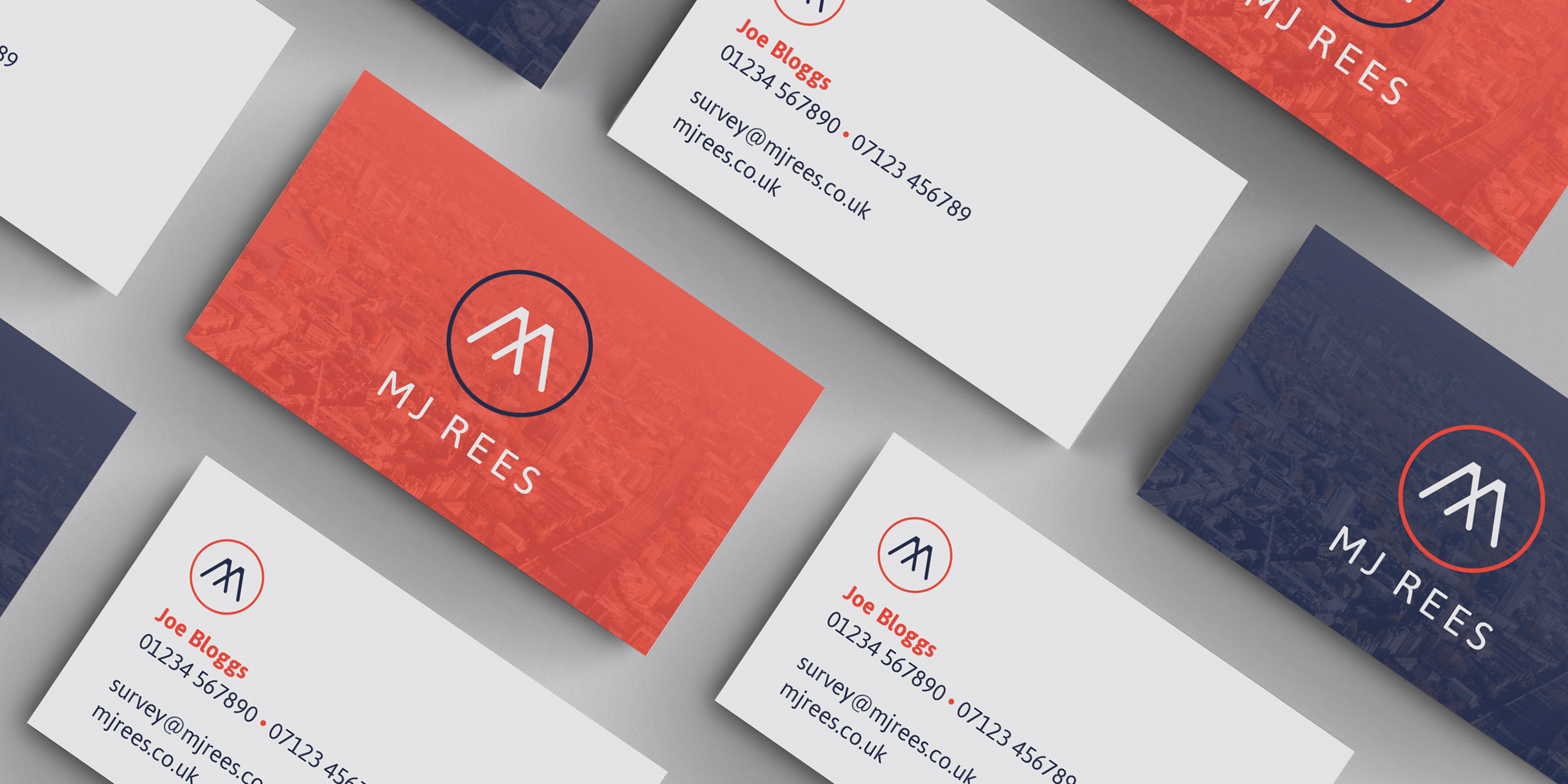
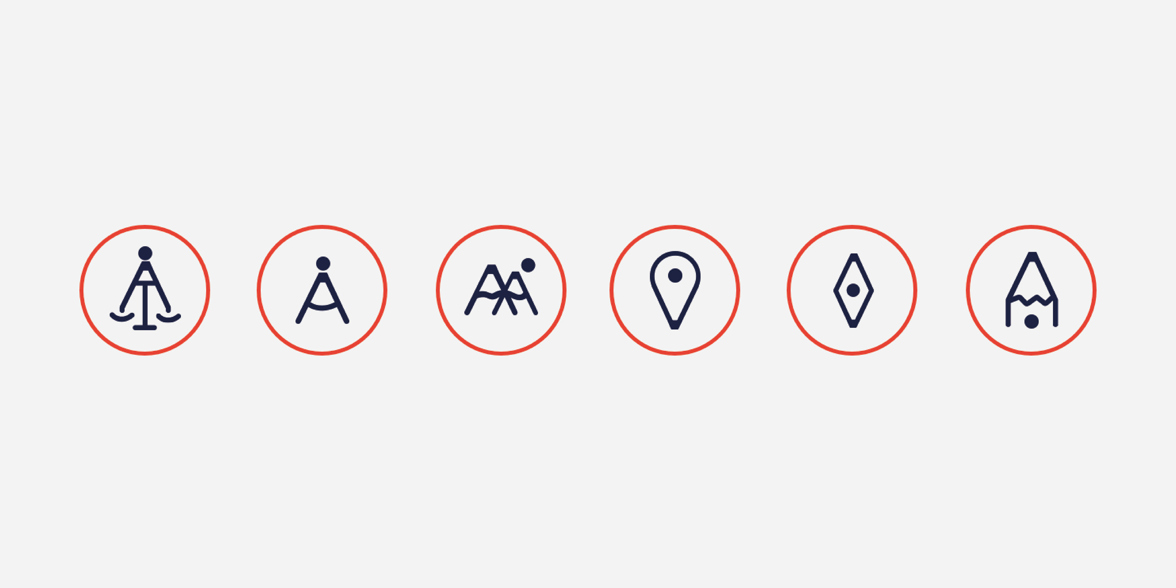
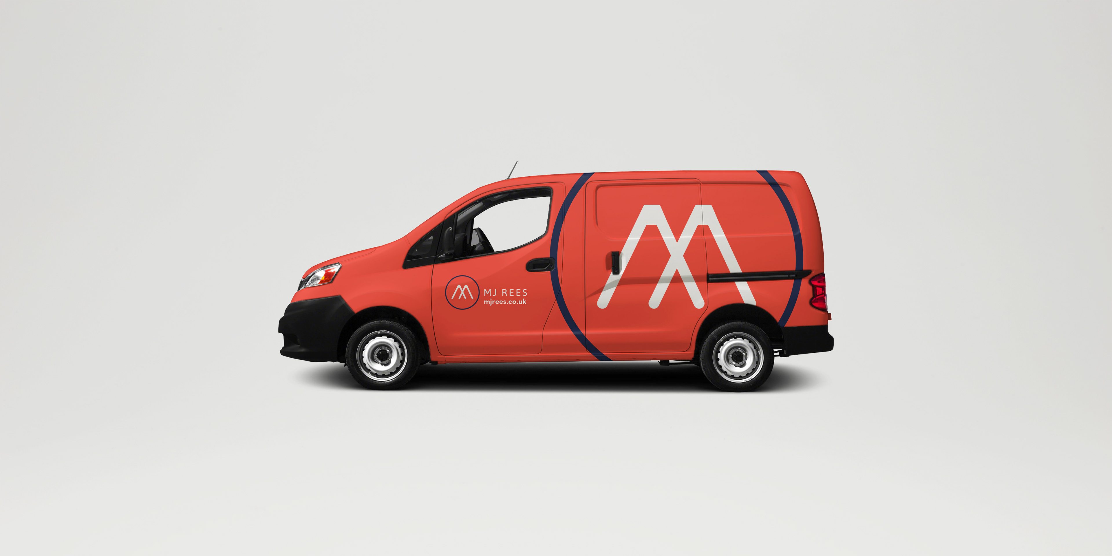
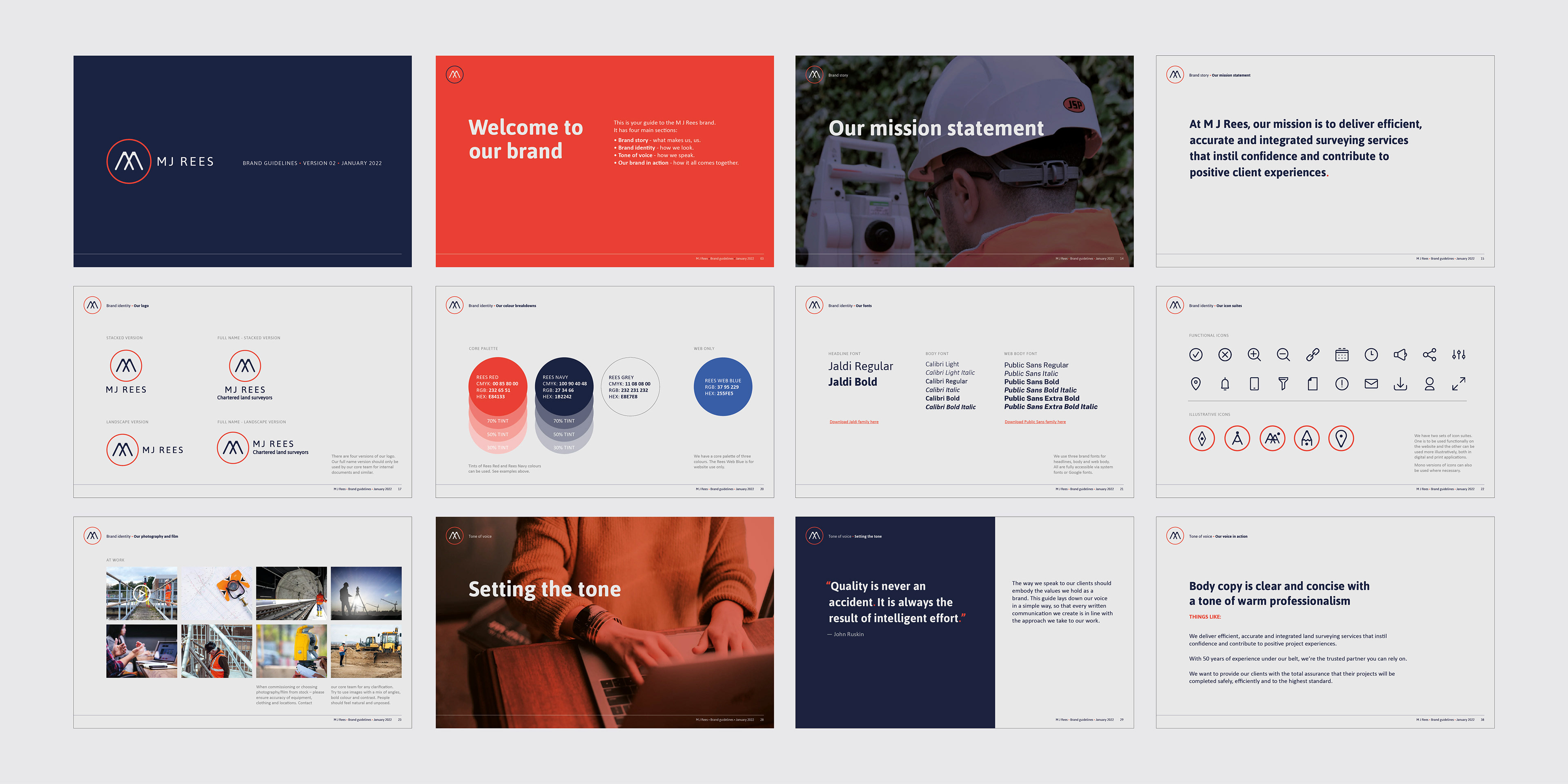
What’s in a logo?
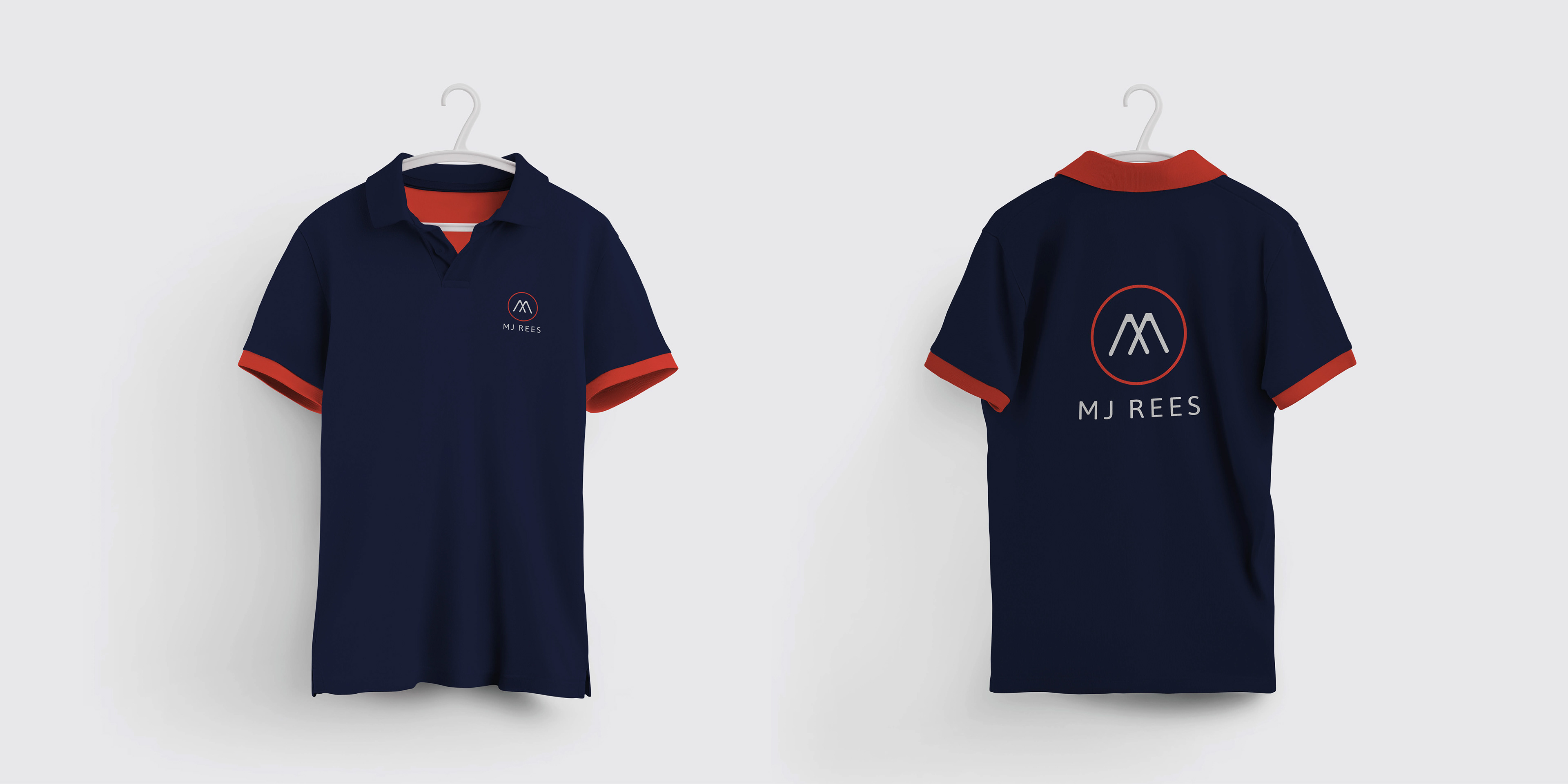
Drawing on iconic shapes in the surveying toolkit, the new M J Rees logo featured bold shapes and colourways to reflect a confident brand positioning. We included a subtle nod to tripods, pencil tips and landscapes without making the logo appear too gimmicky.
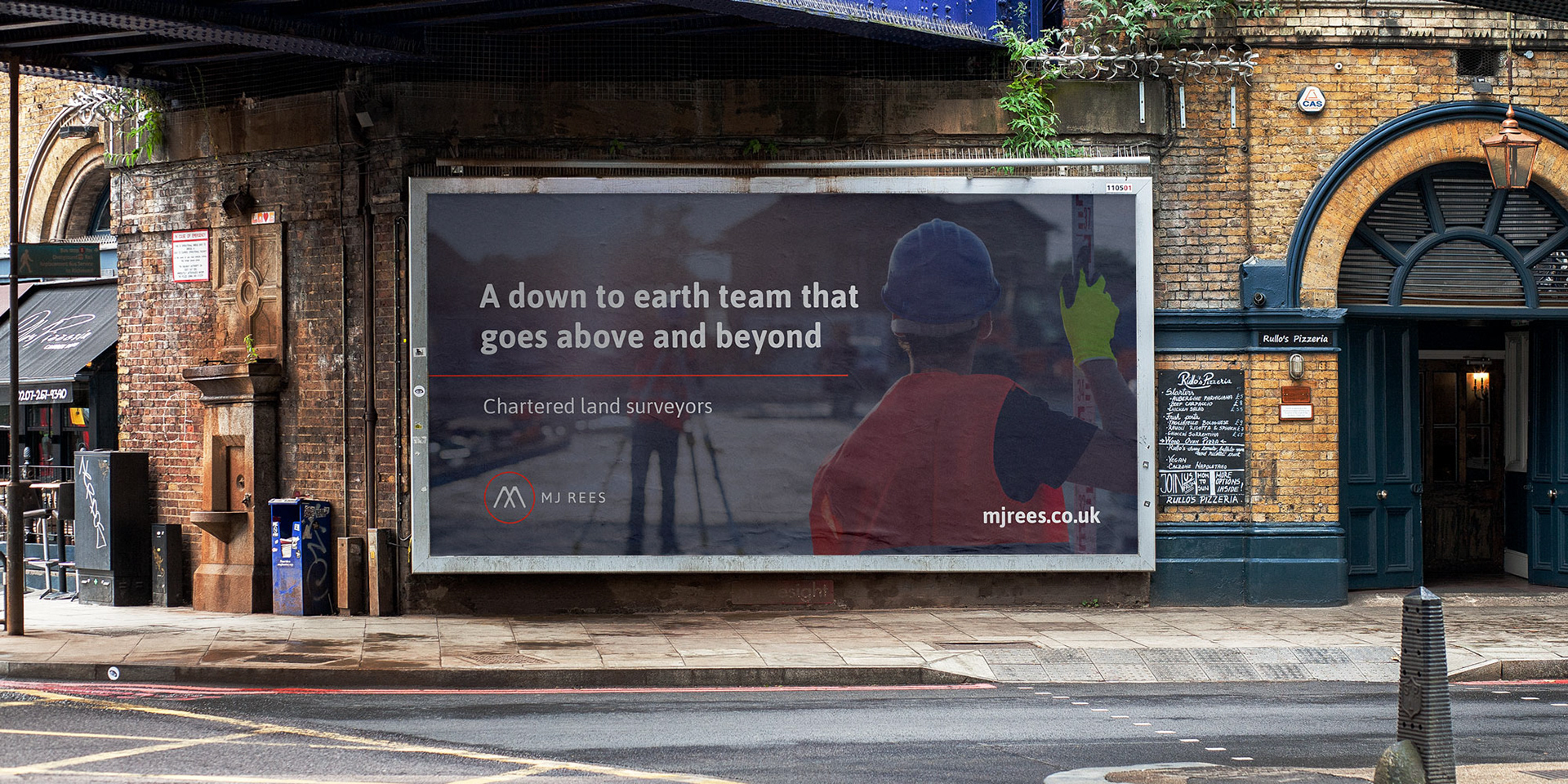
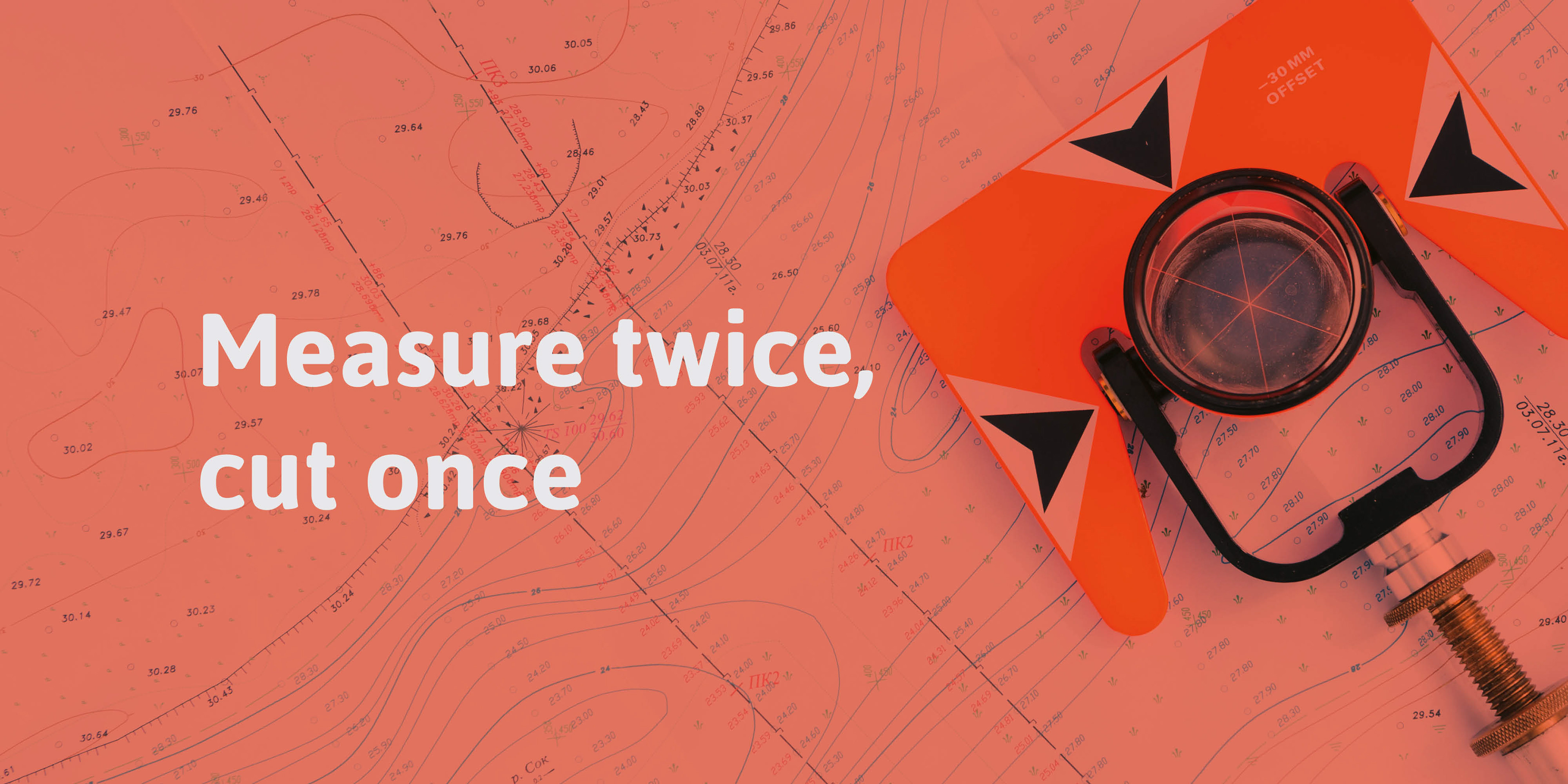
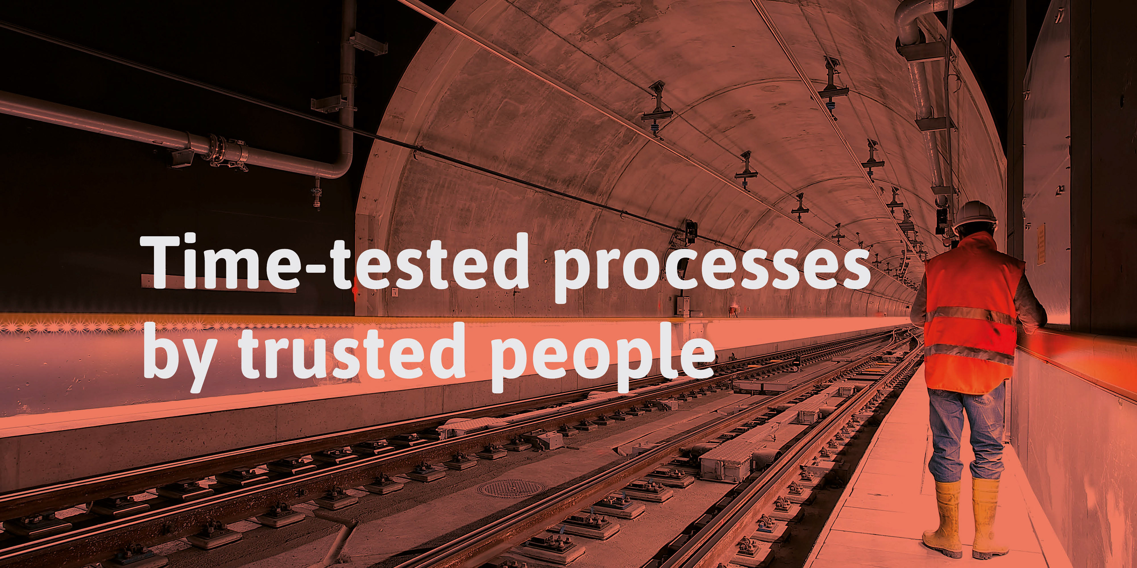
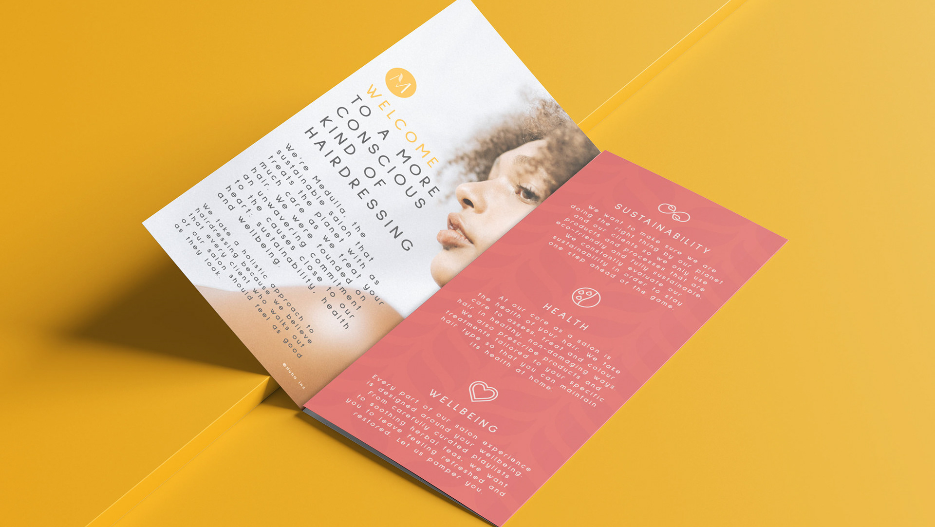
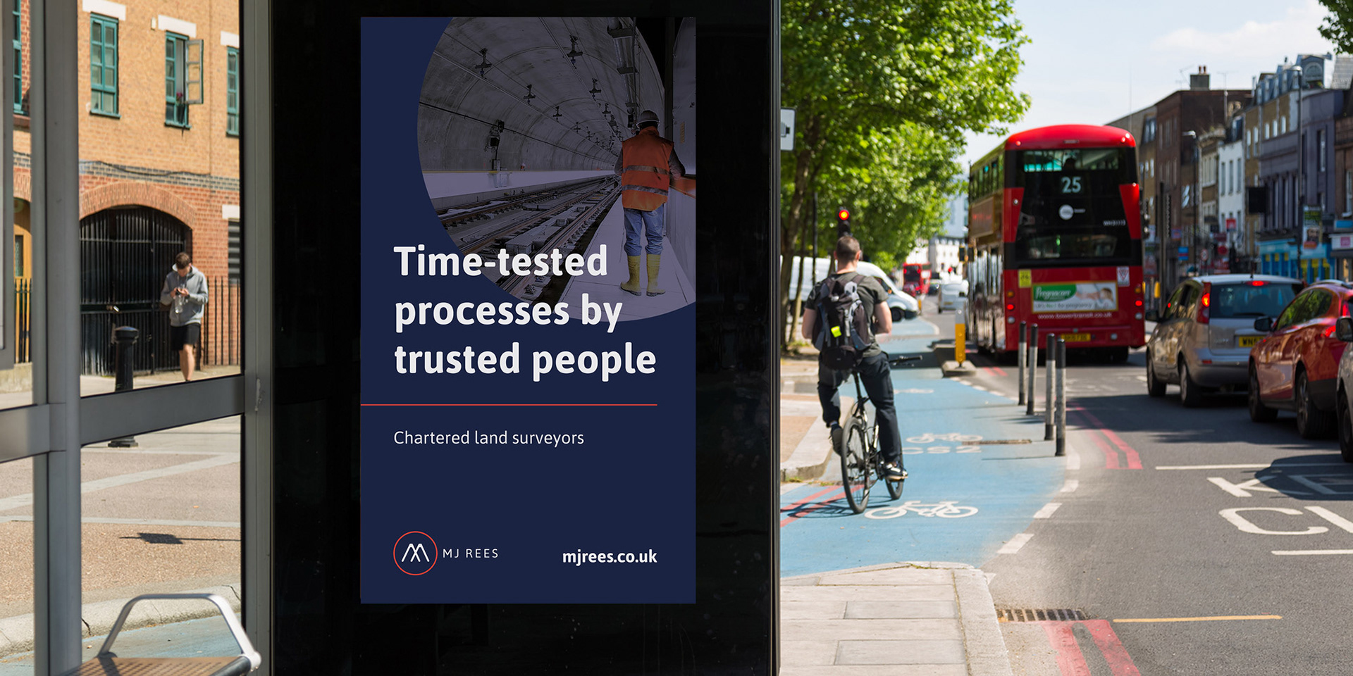
Messaging refresh – brand framework, collateral and imagery
We took nuggets of insight from our brand workshop to create a brand messaging framework that epitomised what M J Rees are all about. Coupled with fresh imagery, icons and a slick overhaul of all marketing collateral – the new brand started to take shape.
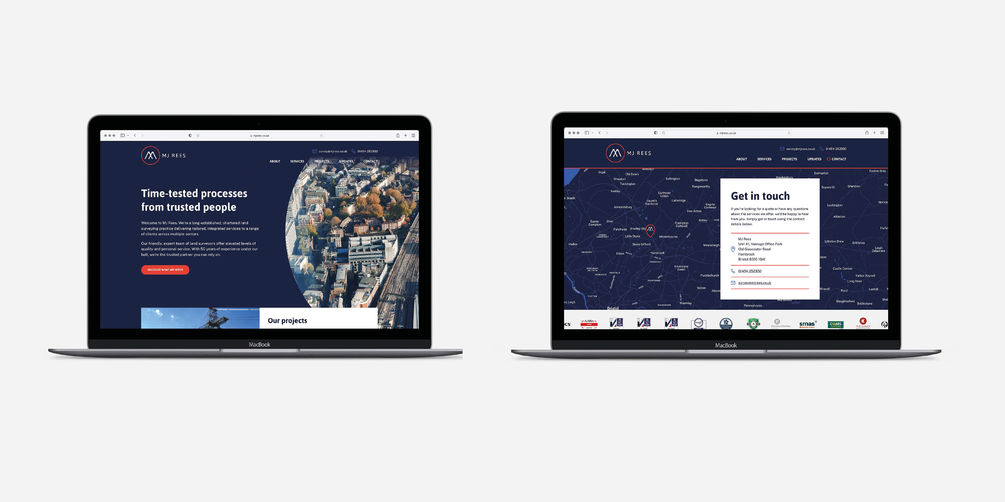
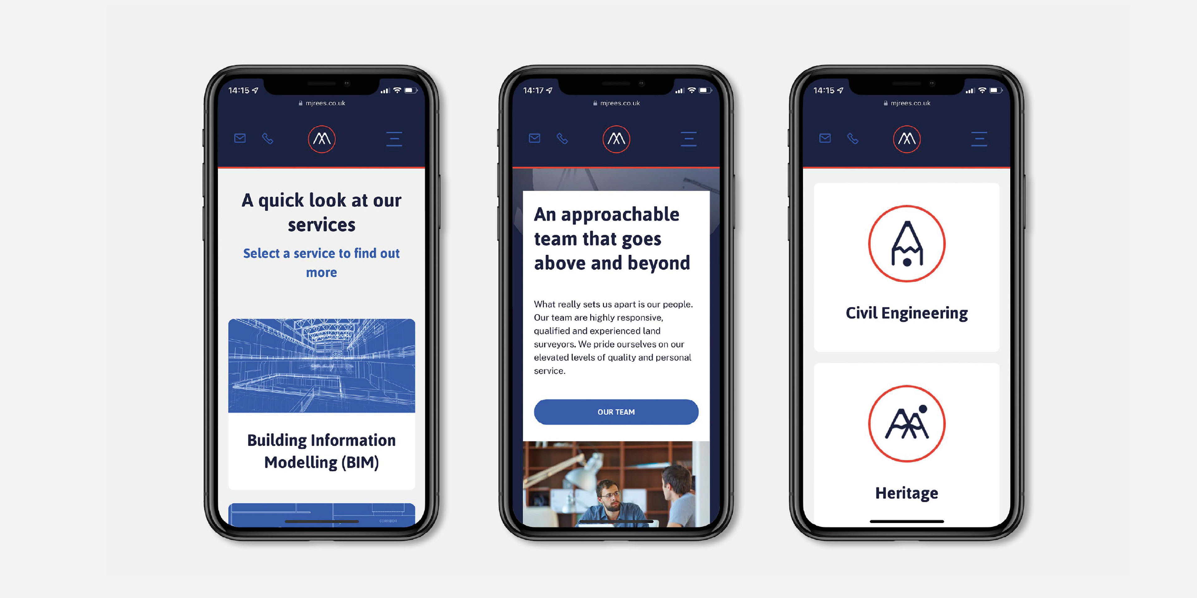
Digital overhaul – website
The M J Rees website wasn’t fit for purpose. It lacked mobile responsiveness, included outdated content and offered a poor user experience. From workshop to wireframe to redesign and build, we reinvented mjrees.co.uk. A sleek, user-friendly design with simple navigation and clear calls to action help to project M J Rees as a practice that’s both forward-thinking and rooted in experience.